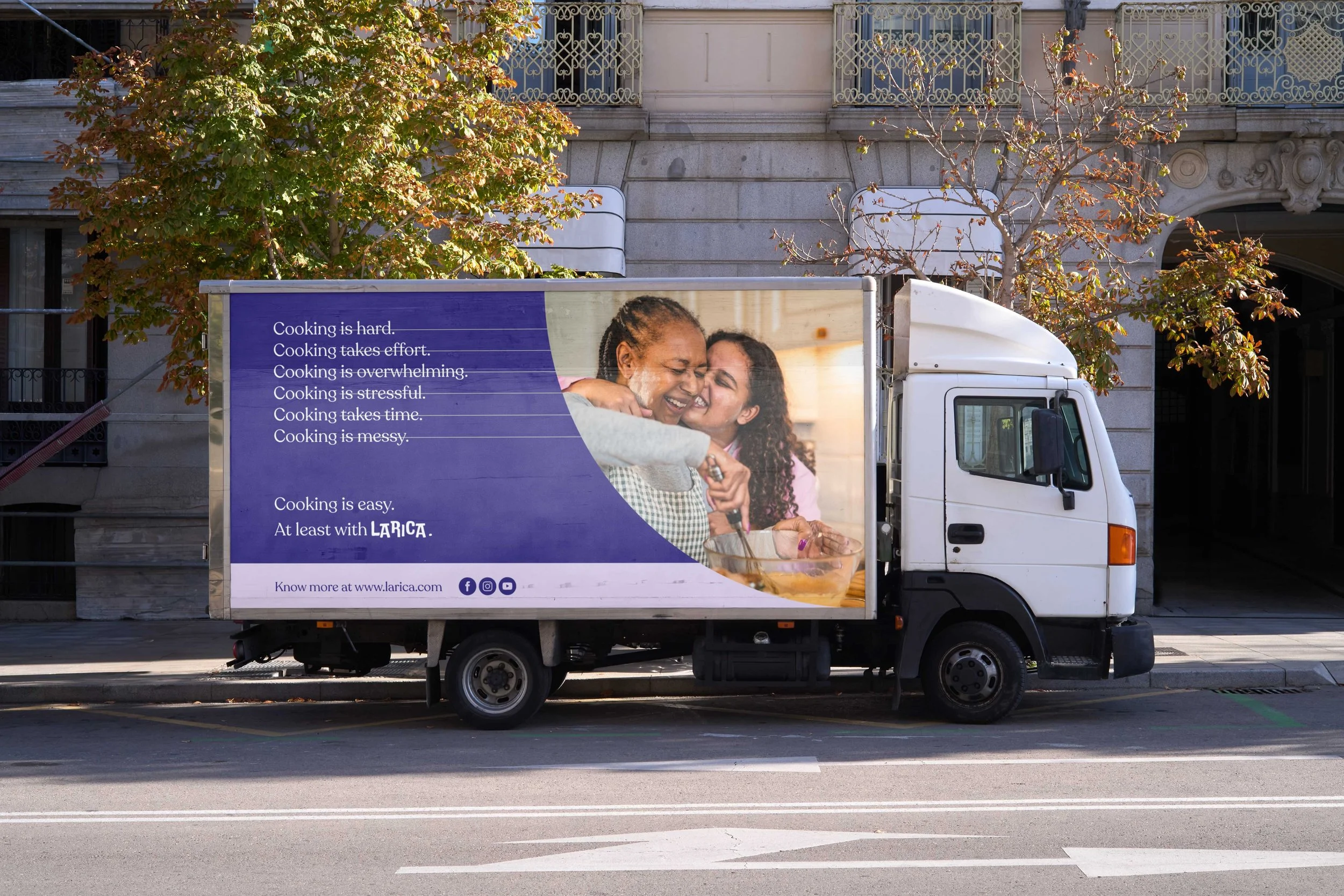
Brand Identity for Larica, a meal-kit service that makes cooking easier.
Larica is a vibrant new food kit service designed to bring joy to the experience of cooking at home. By providing a selection of fresh, prepped ingredients along with chef-curated recipes, Larica ensures that delicious meals are just a doorstep delivery away. Developing the brand involved meticulous strategy formulation, detailed concept planning, and the creation of a cohesive visual identity spanning from the logo design to photography style, color palette, typography choices, and beyond.
Imagery
Background images highlight single products, such as blueberries or pasta, with vibrant, colorful displays, focusing on healthy and nutritious food options.
Patterns
Playful lines add texture and movement, while the frying pan symbolizes the heart of cooking. Additionally, the representation of our submark, featuring 'L,' 'R,' and 'A,' ensures a cohesive identity.
Color Scheme
Lemon Mousse
Hex: #EEECB1
RGB: (238, 236, 177)
CMYK: (7%, 2%, 38%, 0%)
Lavender Glaze
Hex: #A297B3
RGB: (162, 151, 179)
CMYK: (37%, 40%, 13%, 0%)
Kale Salad
Hex: #26593F
RGB: (38, 89, 63)
CMYK: (90%, 38%, 84%, 35%)
Carot Soup
Hex: #E78150
RGB: (231, 129, 80)
CMYK: (4%, 47%, 66%, 0%)
Blueberry Jam
Hex: #292376
RGB: (41, 35, 118)
CMYK: (100%, 100%, 22%, 9%)
Hibiscus Tea
Hex: #A54780
RGB: (165, 71, 128)
CMYK: (31%, 90%, 18%, 0%)
Typeface


